Concept project · Minimalist luxe
HALCYON
Less, but better.
- Products
- Mylar pouches, child-resistant tin sleeves
- Quantity
- 5,000 units
Concept project
Halcyon
the brief
HALCYON — THE BRIEF
Halcyon targets the quiet-luxury buyer — Aesop or Le Labo, not streetwear. The challenge was packaging that felt expensive without using a single graphic flourish. We delivered a matte black pouch with a tiny embossed gold serif wordmark dead-center, a single hairline divider, and one quiet line of strain typography on the back.
how we did it
THE STORY.
When you remove every visual element except what's essential, every remaining choice has to earn its place. For Halcyon, that meant choosing one typeface, one color, and one finishing technique — gold foil on matte black — and trusting them to carry the whole brand. The pouch sits on a dispensary shelf next to bright, busy competitors and disappears in the best way possible. Customers stop, then look closer.
Result: brand consistency from packaging to website, ready for a 12-SKU expansion.
other work
MORE FROM THE STUDIO.
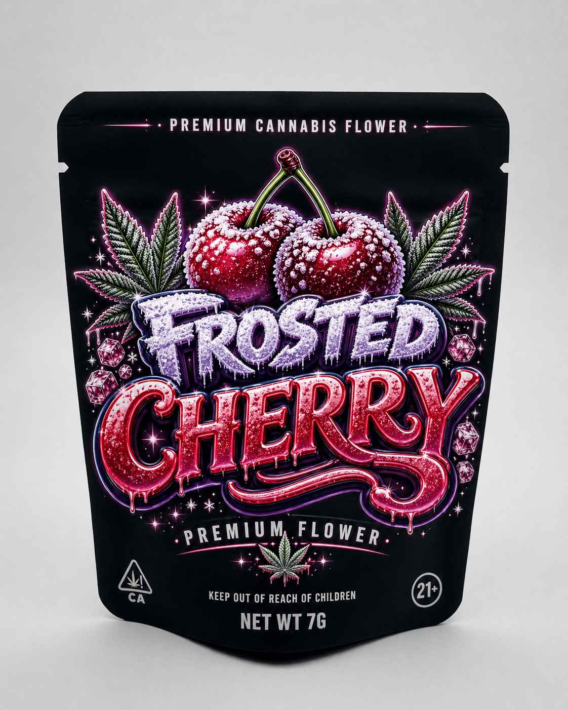
Strain-forward illustration
Client workFrosted Cherry
A strain forward, full-bleed.
View case study →
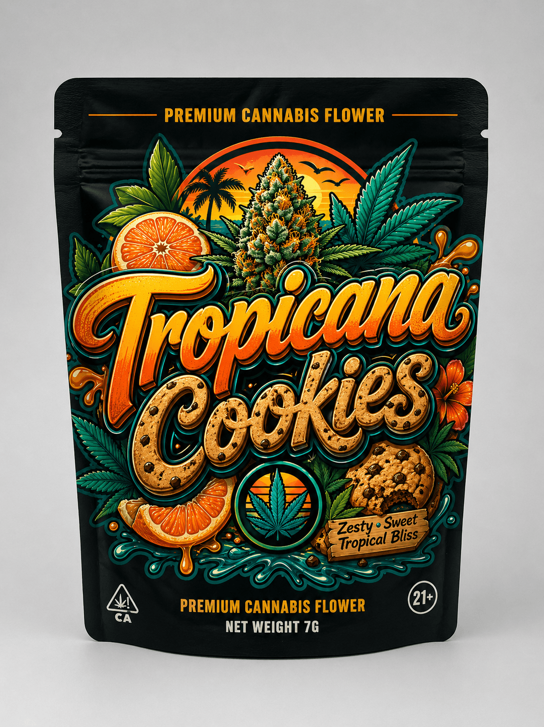
Vibrant illustrative · tropical
Client workTropicana Cookies
Zesty, sweet, tropical bliss.
View case study →
Concept project
vandal hours
Streetwear graffiti
Concept projectVandal Hours
After dark. On purpose.
View case study →
stop sticking labels
STOP STICKING LABELS ON STOCK POUCHES.
Submit a quote request today. We'll come back with a written quote and a kickoff call within one business day.
Request a Quote →